About
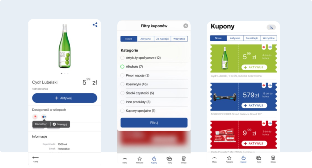
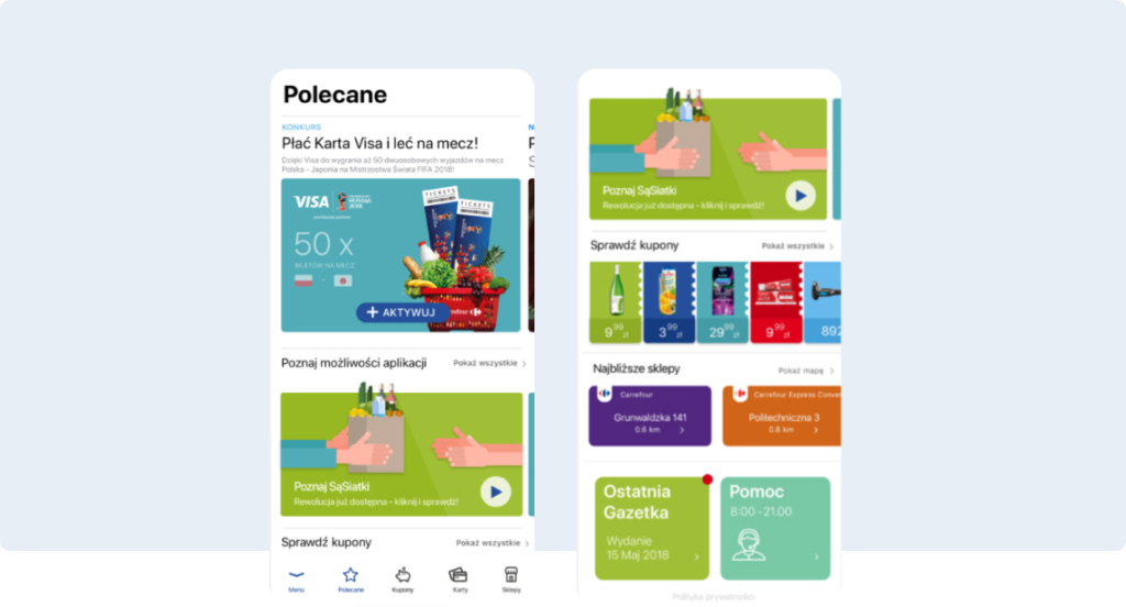
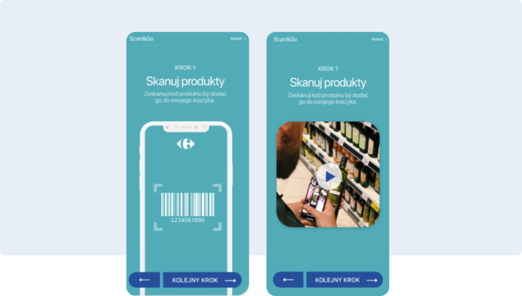
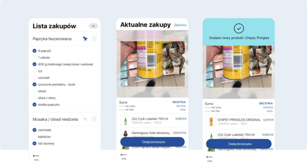
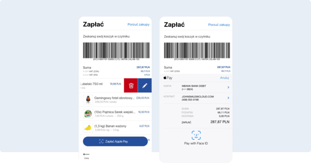
We were asked to redesign some crucial screens of the mobile app as a part of future collaboration. Our task was to re-think User Experience and propose a new User Interface layer.
Menu
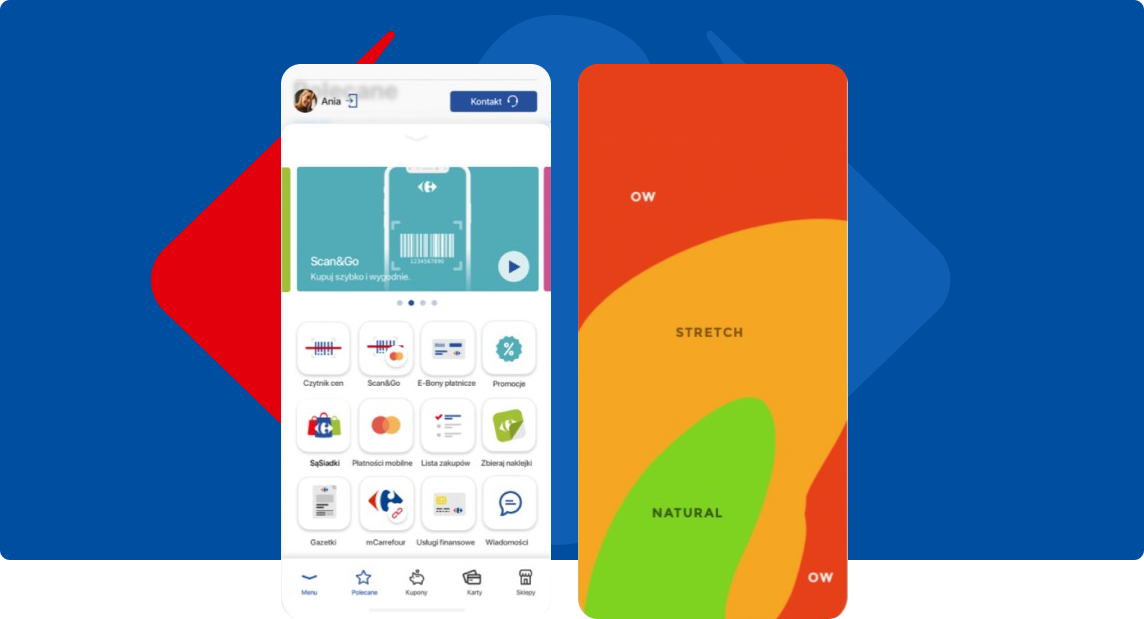
01. We merged the double menu into one, sliding from the bottom…This approach made for a better experience when using the phone with one hand. We took into account that during shopping, people can have their other hand occupied by pushing a shopping cart or carrying a basket.
02. Areas of comfortable thumb reach when using a smartphone.


